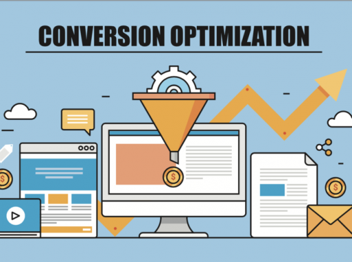
Conversion optimization is a matter of figuring out how to do better. Better digital marketing, the kind that gets you the results you’re after. It’s a matter of science, creativity, persistence, and, well, luck. Or as we prefer to call it: trial and error. Or trial by fire, maybe.
At any rate, at 800.com, our trial by fire has come on behalf of hundreds of clients over years of experience helping to optimize digital marketing campaigns. Here’s what we consider a very rudimentary step-by-step process for getting the most out of your campaigns.
Set Realistic Goals
How will you know you got there if you don’t know where “there” is? Your first attempt will be your benchmark. If you get fortunate, the results will be so gratifying that all you’ll have to remember to do the next time and every time after that is exactly what you did that first time.
Yeah, it happens, we suppose. About as often as lightning striking the same place twice. (But way more gratifying) It’s much more typical for those first results to be a bit underwhelming, to be kind.
Benchmark them nonetheless. And decide if you were realistic in your call to action (CTA). Was it likely that you’d sell 500 books or $50,000 worth of jewelry or gain a dozen new clients on the strength of a few social media ads?
Have a Measurable Call to Action
Imagine running for public office and giving an emotionally stirring soapbox speech and then going home without asking anyone to vote for you. Uh oh. No CTA.
What do you want your clients or customers to do? That’s where the “realistic” in realistic goals come into play. You’ll know how realistic you are (or aren’t) by how close you come to those goals.
If you think you’ll sell those 500 books we mentioned and you get orders for three, it’s back to the laboratory. (Which isn’t a bad thing, by the way. Remember that “trial and error” component of conversion optimization? You just erred. Now you have a benchmark for doing better.)
For that matter, it’s not always about selling products or signing up new clients. Sometimes simply giving away a certain number of free brochures is meaningful. You should not run out of business cards during a grand opening. Signing up new subscribers to your free digital newsletter also remains helpful.
Crunch the Numbers
You’ve got a mile runner whose goal is to set a world record. She crosses the finish line in a blur of speed, and you know nothing.
You know nothing unless you also know precisely when the starter’s pistol went off at the starting line. If you don’t have all the numbers, you can’t compile meaningful data.
That’s sort of like trying to measure the results of your digital ad campaign if you don’t know what you were trying to accomplish. What did you want your target audience to do? Was it a realistic expectation? If you don’t know your starting point, you’ll never know when—or if—your campaign crossed the finish line.
We mentioned a digital newsletter sign-up call-to-action. Let’s say 100 respondents signed up for a subscription. And that historically you sell an average of $1,000 a year in products or services to ten percent of new newsletter subscribers.
Do the math. You can reasonably expect to do $10,000 in new business in the next 12 months resulting from that campaign. Now let’s say your advertising costs were $1,000. That seems like a success, but only you know for sure after crunching the numbers.
Once you have a realistic CTA, you can measure your conversion rate (the number of respondents who take action based on your CTA) as a percentage of visitors to your website or wherever your message gets posted. If you have 10,000 visitors and 1,000 of those visitors take action, you have a ten percent conversion rate.
If that’s the result of your first digital campaign, keep that benchmark in mind. Everything else you do will either be better, worse or about the same. You can revise accordingly.
Optimize Your User Experience
Just to confuse you, user experience is called UX. Digital advertisers want to make the UX as pleasant as possible. If you have an ad on Facebook that leads to a landing page that, in turn, leads to a home page that has no immediate mention of whatever hook got them there, you’ve created a horrible UX.
Your object in optimizing UX is to make the trip as short and straightforward as possible. Think of it as signs on the road to your brick-and-mortar location. If you have an endless number of signs, all with twisty arrows and complicated directions about changing lanes and taking back roads, and suddenly those signs disappear miles from your location, you’ve lost your customers.
In the best-case scenario, they eventually find your place on their own, but they’re in the mood to hate everything they see and complain about every price tag.
It’s the same online. Only worse. That’s because hundreds of your competitors are also just a few keystrokes away. If it takes a prospect ten seconds to get to your page (the wrong one) but only three seconds to get to someone else’s better-targeted page, you’ve lost the sale.
Consider the Use of Vanity Phone Numbers
If you owned an employment agency, tell us which phone number your target audience would remember longer: (800) 438-2562 or (800) GETaJOB. You know the answer.
A toll-free vanity phone number relevant to ad respondents based on their needs can dramatically improve conversion rates. An easy-to-remember toll-free number removes many of the obstacles your clients or customers might have. That makes a better user experience and happier prospective customers.
At 800.com, we can provide your marketing with highly strategic and targeted toll-free phone numbers. Our goal—like yours—is to optimize your conversion rates. So let’s get to work on your next digital campaign. Visit 800.com or call us at (800) 800-4321.


